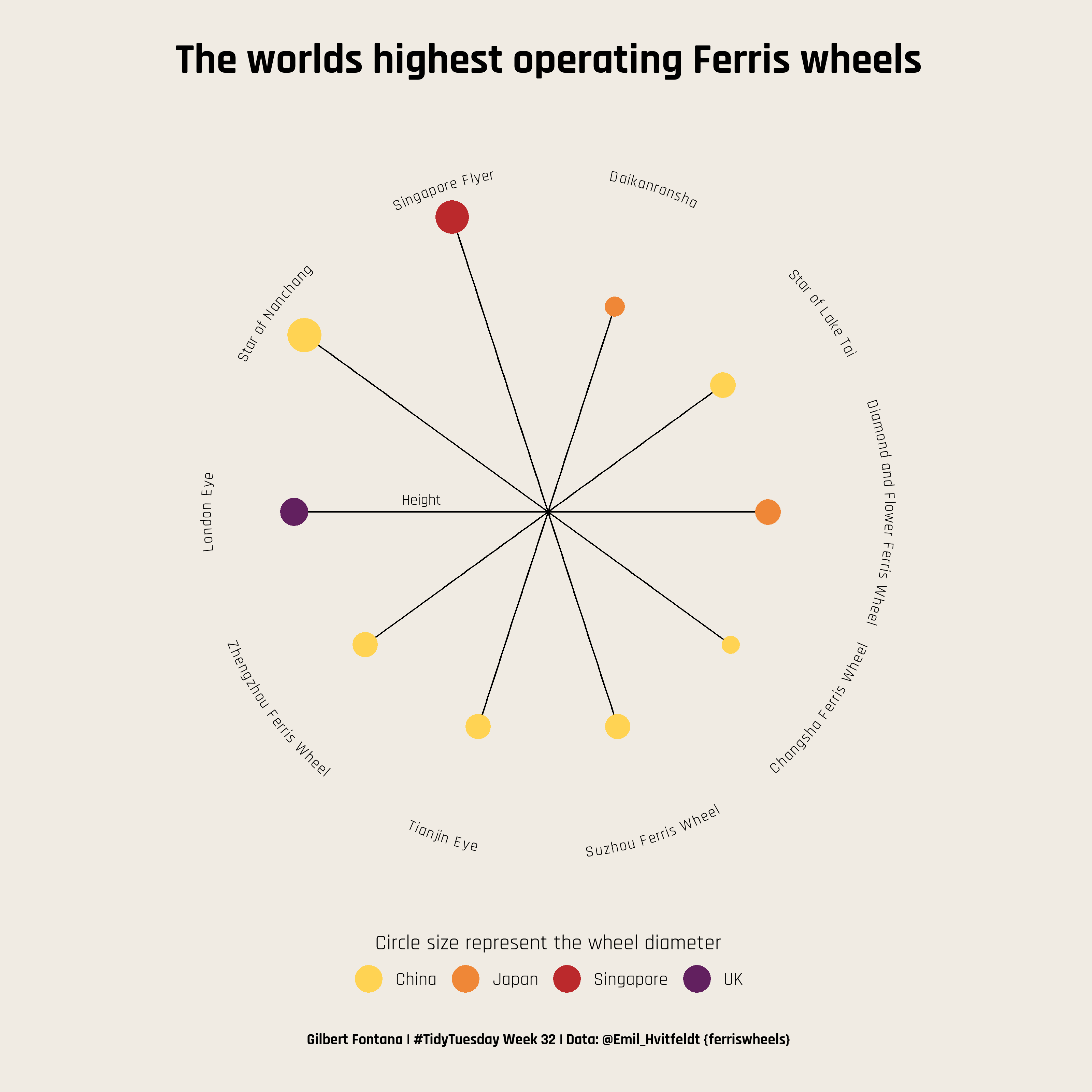
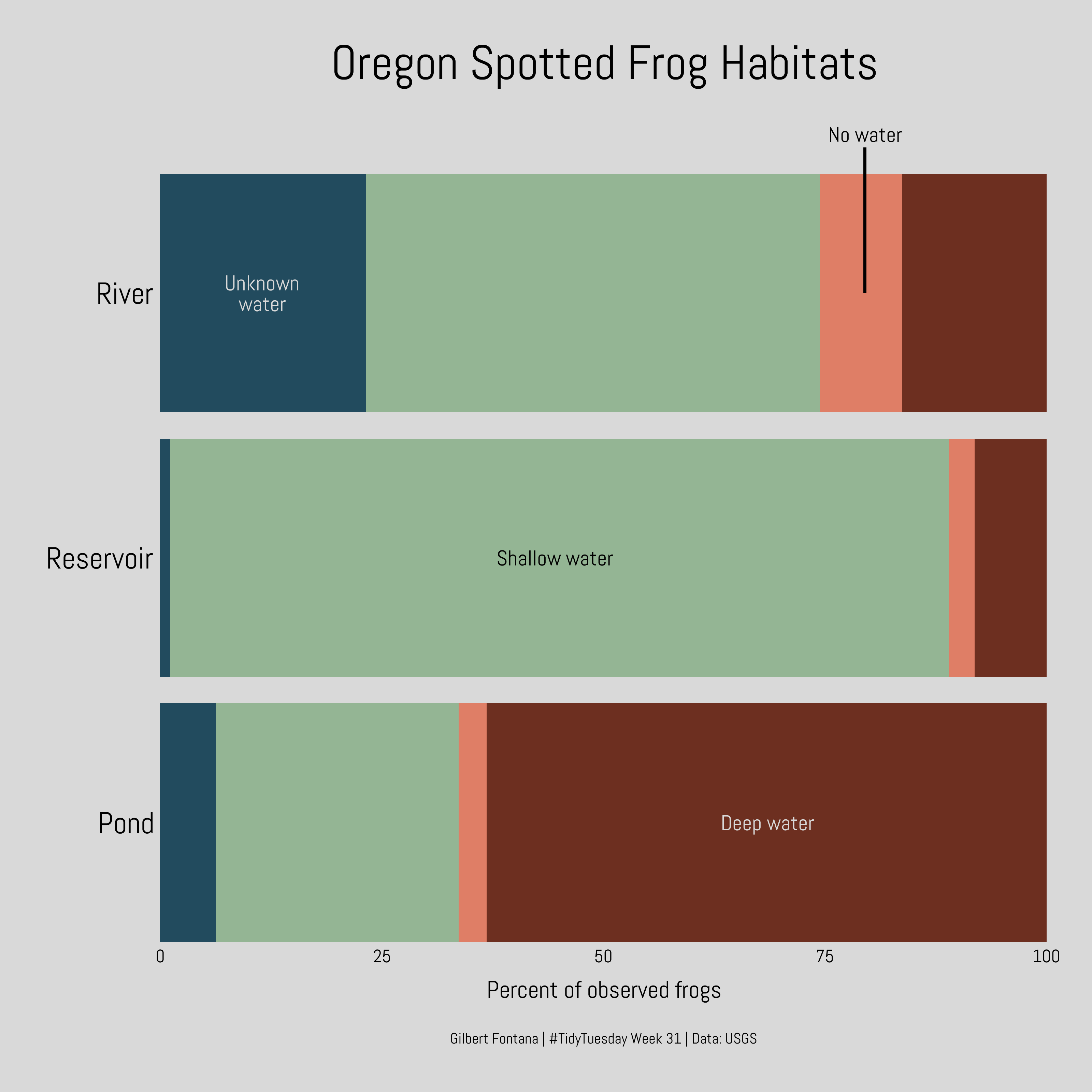
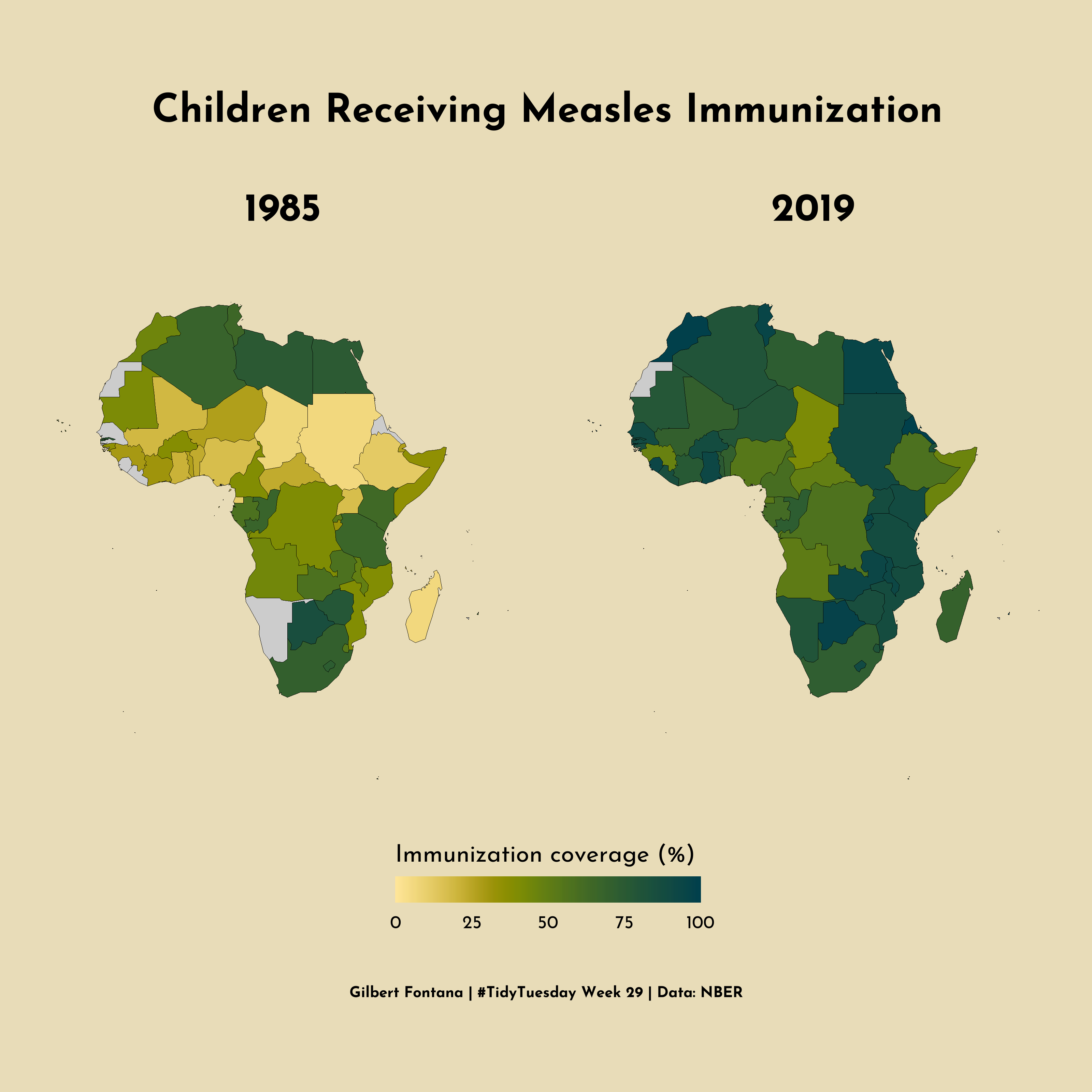
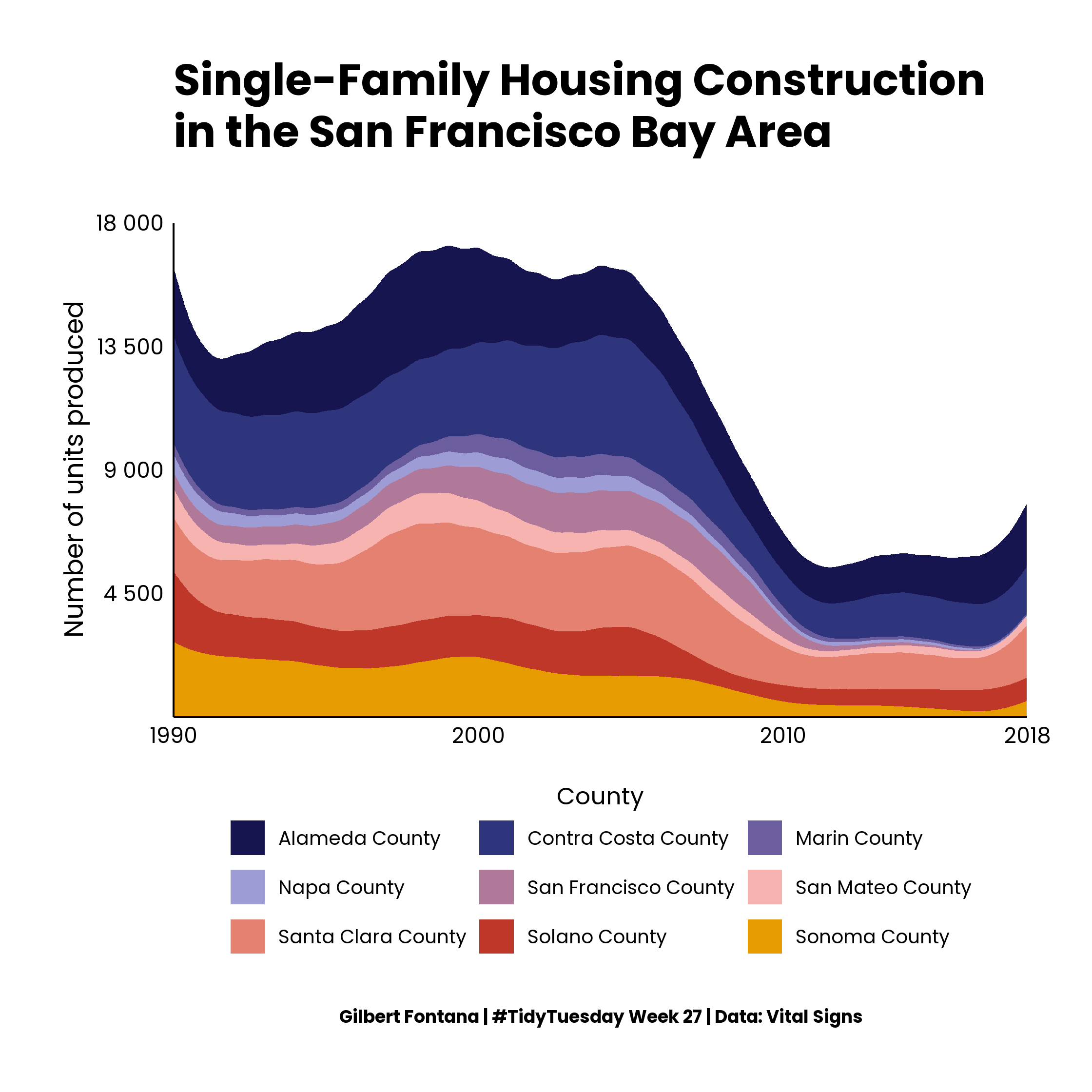
Data Visualization
University of St.Gallen
October 27, 2022
#TidyTuesday
- A weekly data project by the
R4DS Online Learning Community
and Thomas Mock
- A great way to practice data
visualization and learn from
others!
Visualization walkthrough
Visualization walkthrough
Step 1
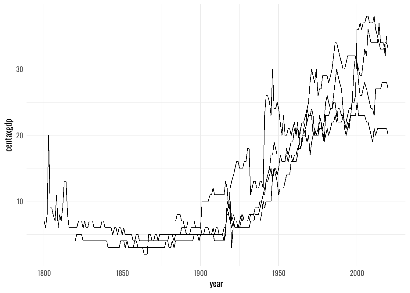
Visualization walkthrough
Step 2
Visualization walkthrough
Step 3
Visualization walkthrough
Step 4
Visualization walkthrough
Step 5
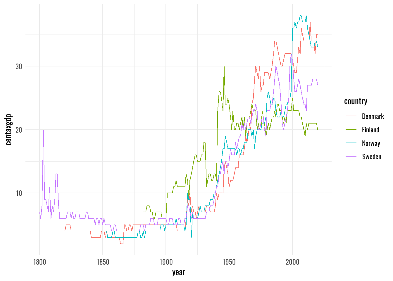
Visualization walkthrough
Step 6
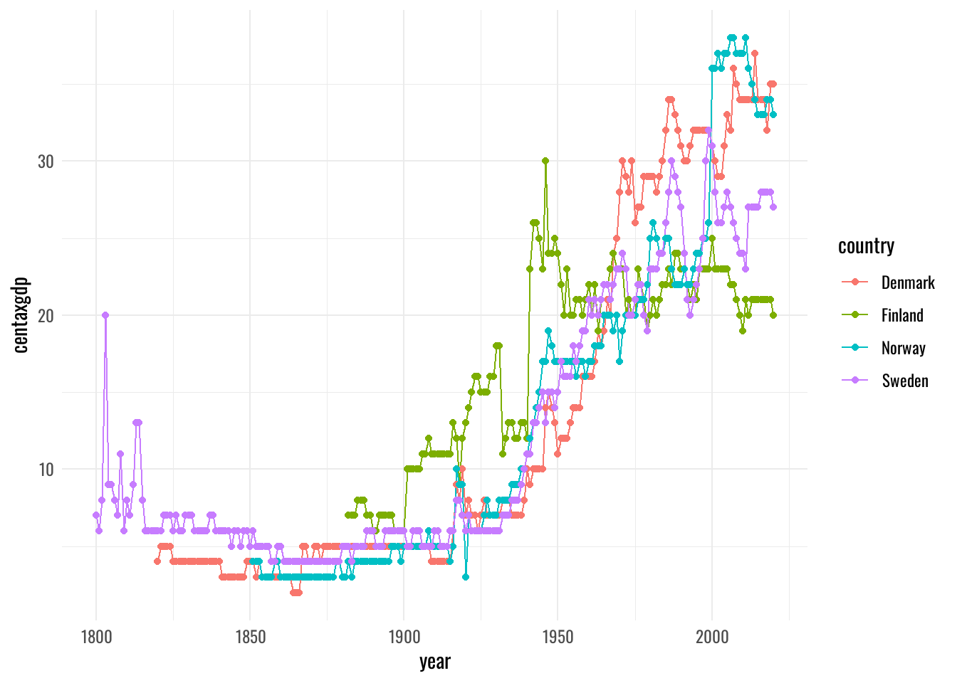
Visualization walkthrough
Step 7
Visualization walkthrough
Step 8
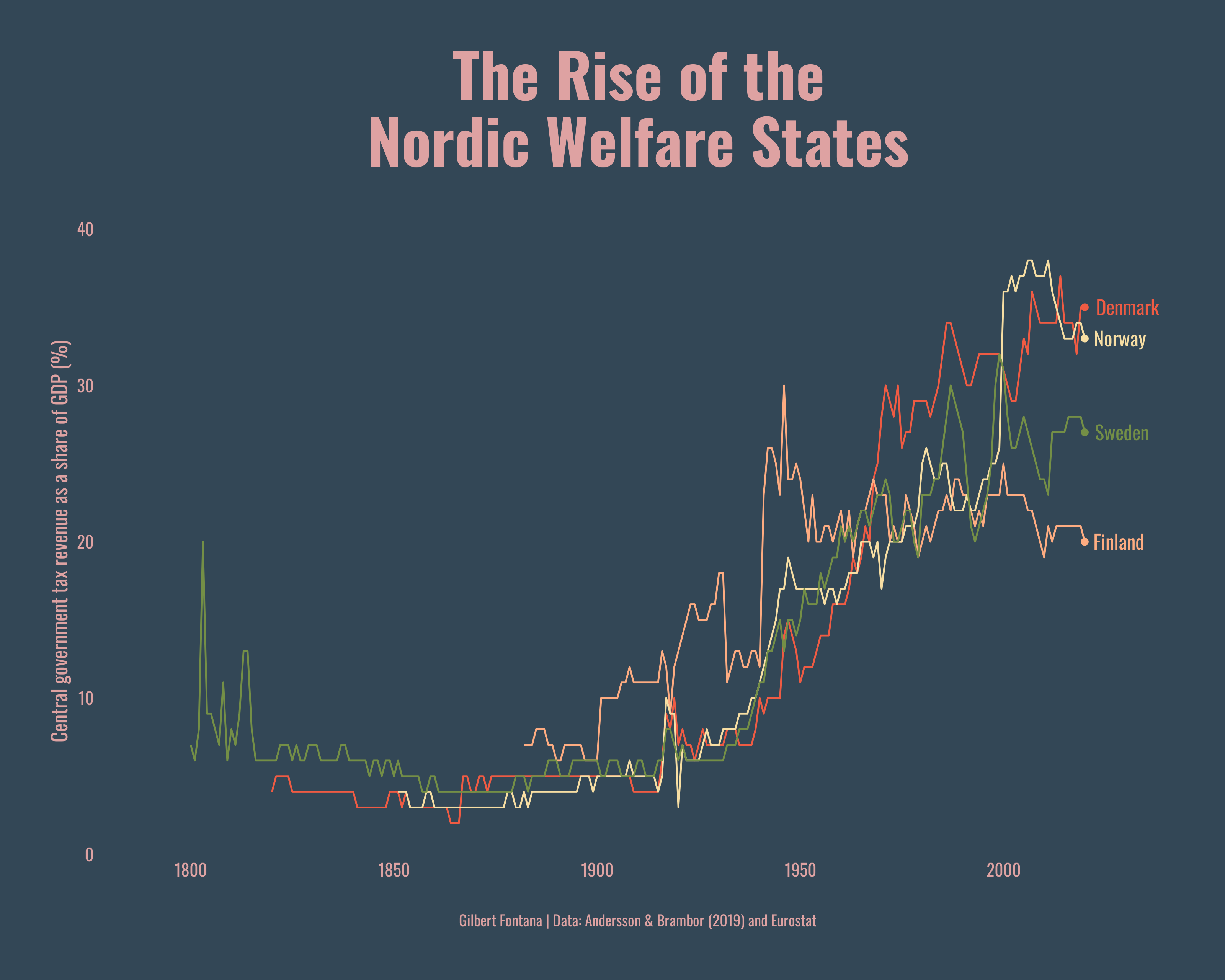
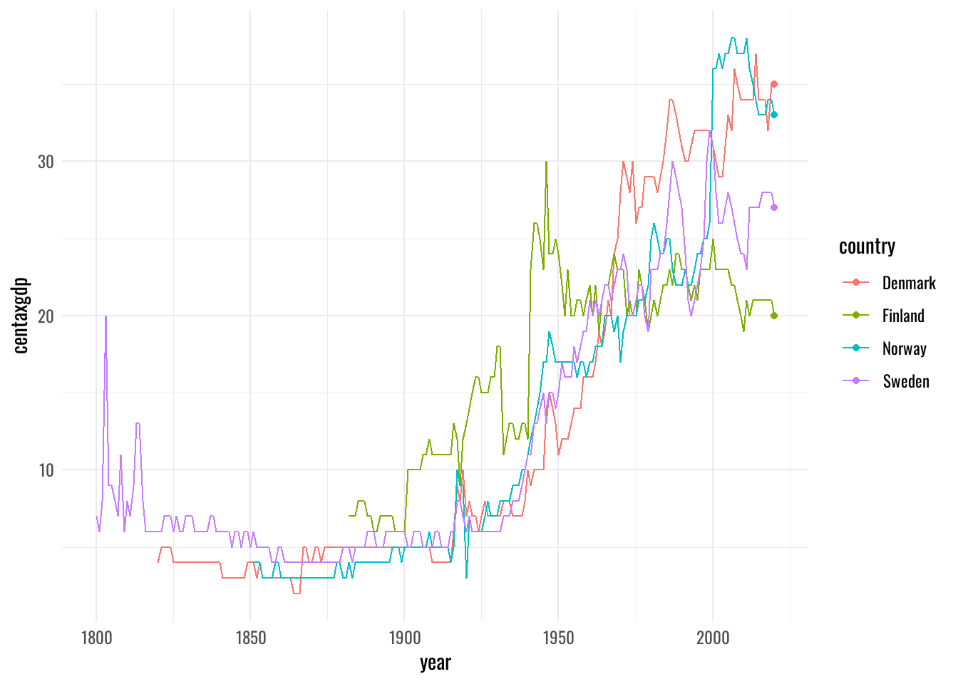
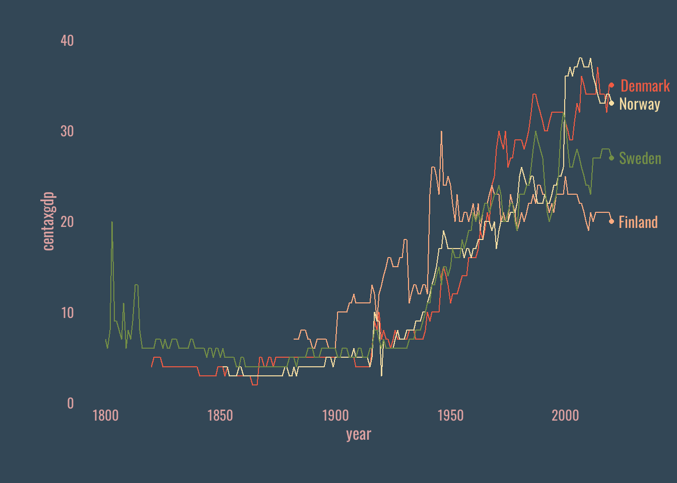
df %>%
  ggplot(aes(x=year,
             y=centaxgdp,
             group=country)) +
geom_line(aes(color=country)) +
geom_point(data = df %>% filter(year=="2020"),
aes(color=country)) +
geom_text(data = df %>% filter(year=="2020"),
aes(label=country,
color=country),
hjust = -.2,
family = font,
size = 4) +
theme(legend.position = "none")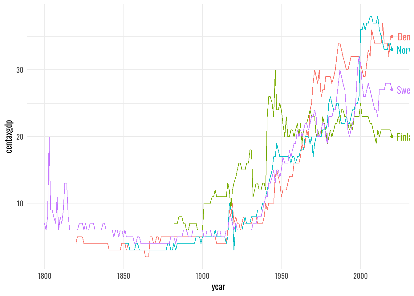
Visualization walkthrough
Step 9
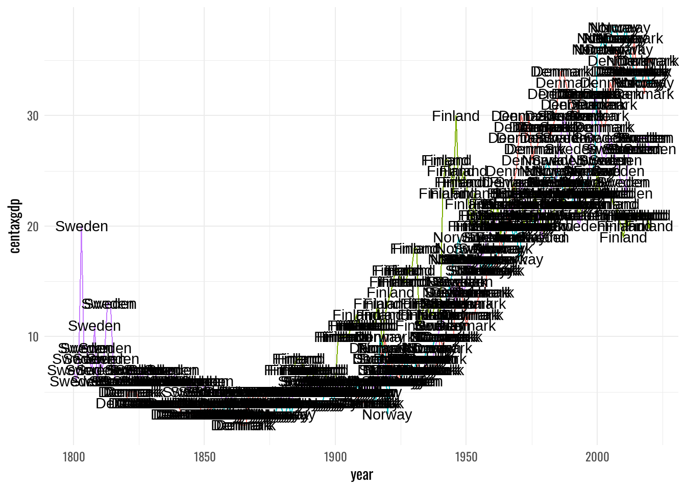
df %>%
  ggplot(aes(x=year,
             y=centaxgdp,
             group=country)) +
  geom_line(aes(color=country)) +
  geom_point(data = df %>% filter(year=="2020"),
aes(color=country)) +
geom_text(data = df %>% filter(year=="2020"),
aes(label=country,
color=country),
hjust = -.2,
family=font,
size = 4) +
coord_cartesian(clip = "off") +
theme(legend.position = "none",
plot.margin = margin(30, 30, 30, 30))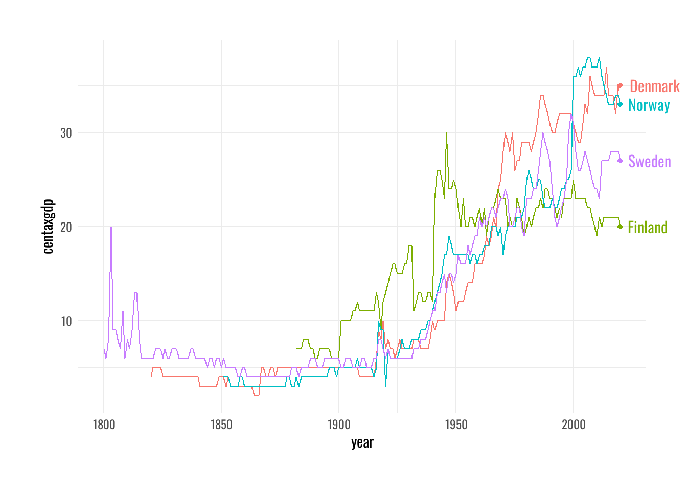
Visualization walkthrough
Step 10
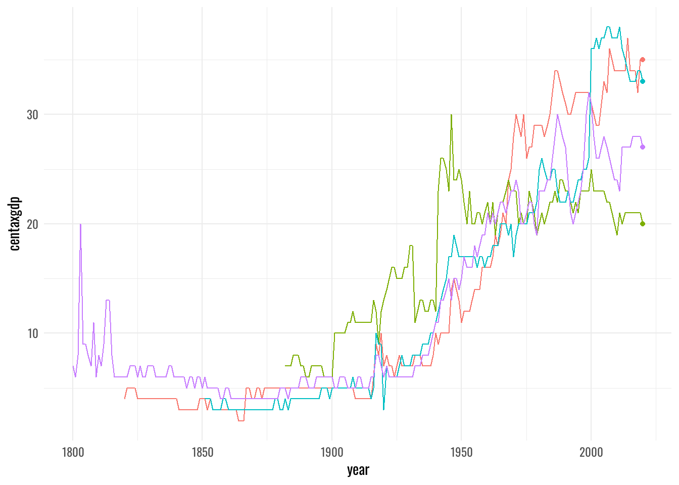
df %>%
  ggplot(aes(x=year,
             y=centaxgdp,
             group=country)) +
  geom_line(aes(color=country)) +
  geom_point(data = df %>% filter(year=="2020"),
             aes(color=country)) +
  geom_text(data = df %>% filter(year=="2020"),
            aes(label=country,
                color=country),
            hjust = -.2,
            family = font,
            size = 4) +
  coord_cartesian(clip = "off") +
  scale_color_manual(
    values = met.brewer(name = "Paquin",
                        type = "discrete",
                        n = 4)) +
  theme(legend.position = "none",
        plot.margin = margin(30, 30, 30, 30))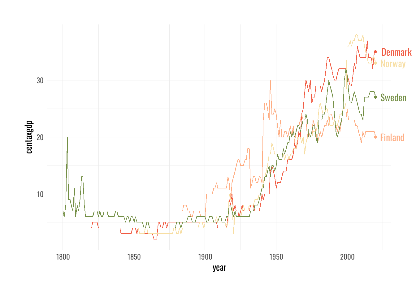
Visualization walkthrough
Step 11
df %>%
  ggplot(aes(x=year,
             y=centaxgdp,
             group=country)) +
  geom_line(aes(color=country)) +
  geom_point(data = df %>% filter(year=="2020"),
             aes(color=country)) +
  geom_text(data = df %>% filter(year=="2020"),
            aes(label=country,
                color=country),
            hjust = -.2,
            family = font,
            size = 4) +
  coord_cartesian(clip = "off") +
  scale_color_manual(
    values = met.brewer(name = "Paquin",
                        type = "discrete",
                        n = 4)) +
  scale_y_continuous(limits = c(0,40),
                     expand = c(0,0)) +
  theme(legend.position = "none",
        plot.margin = margin(30, 30, 30, 30))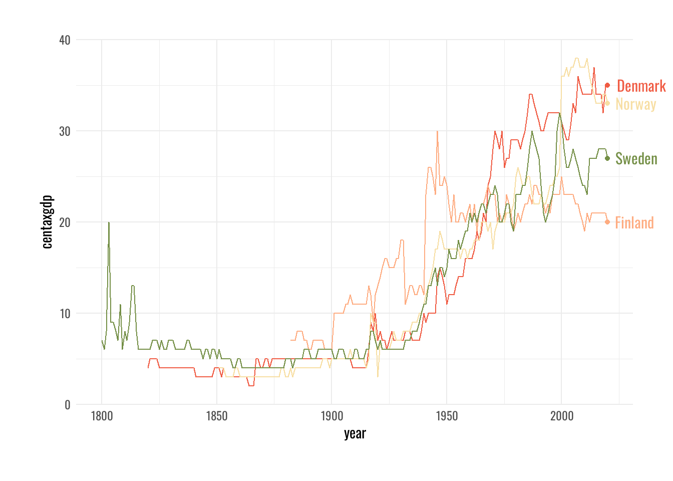
Visualization walkthrough
Step 12
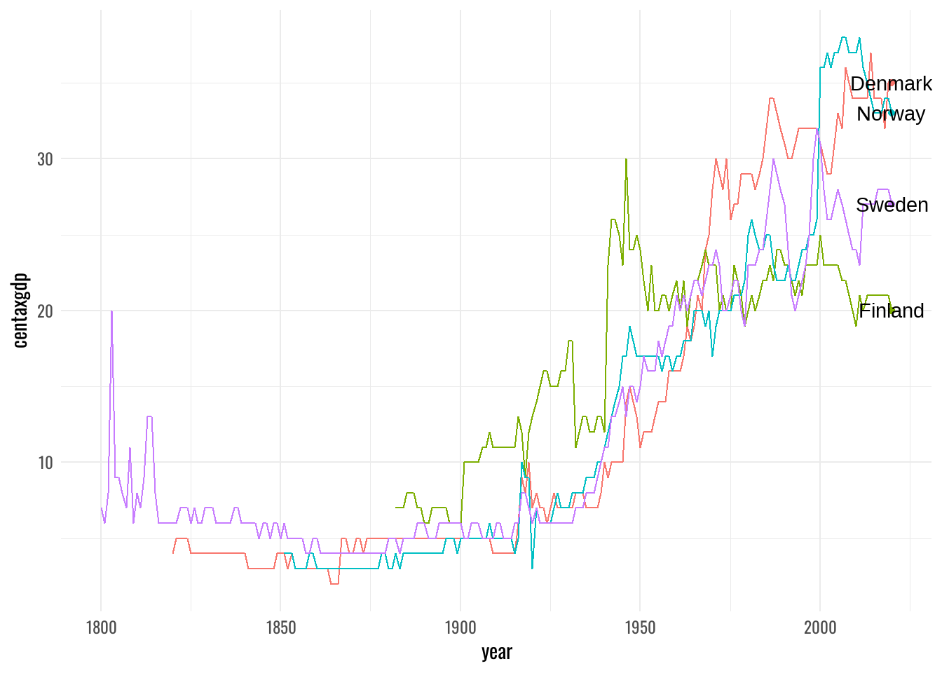
df %>%
  ggplot(aes(x=year,
             y=centaxgdp,
             group=country)) +
  geom_line(aes(color=country)) +
  geom_point(data = df %>% filter(year=="2020"),
             aes(color=country)) +
  geom_text(data = df %>% filter(year=="2020"),
            aes(label=country,
                color=country),
            hjust = -.2,
            family = font,
            size = 4) +
  coord_cartesian(clip = "off") +
  scale_color_manual(
    values = met.brewer(name = "Paquin",
                        type = "discrete",
                        n = 4)) +
  scale_y_continuous(limits = c(0,40),
                     expand = c(0,0)) +
  theme(
    panel.grid = element_blank(),
    axis.text = element_text(color = txt_col,
                             size = 10),
    axis.title = element_text(color = txt_col,
                              size = 12),
    legend.position = "none",
    plot.margin = margin(30, 30, 30, 30),
    plot.background = element_rect(fill = bg,
                                   color = bg)
  )
Visualization walkthrough